The Problem
Collins Brothers had built a reputation as a premium moving company—but their digital presence told a different story.
Both of their core properties, collinsbros.com and despatchmovers.com, felt outdated, inconsistent, and disconnected from the brand customers experienced in the real world. The typography lacked cohesion. The visual system wasn’t aligned. And the overall experience failed to communicate the level of care and professionalism that defined the business.
This created a gap between perception and reality.
For a service built on trust, discretion, and precision, the website is often the first signal. In this case, it was working against them.
Adding to the challenge, the team had no usable photography library. There was no visual foundation to build a modern, premium experience.
The Approach
We began by grounding the work in the brand they already had—but weren’t fully leveraging.
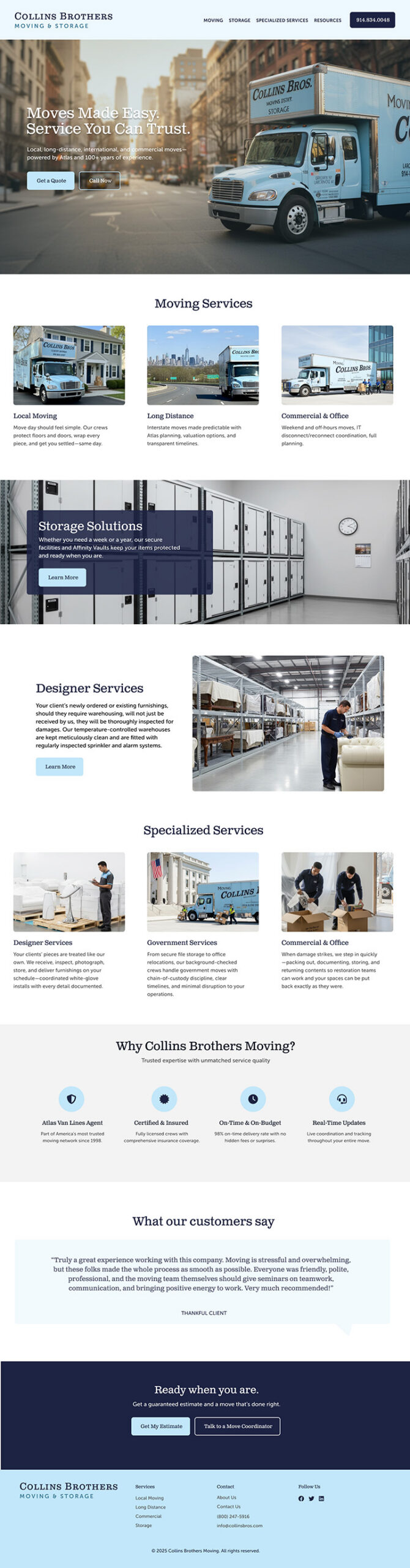
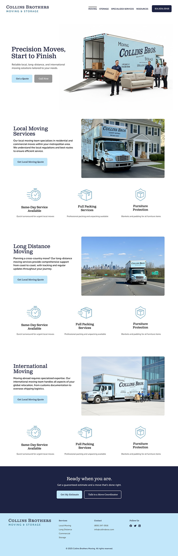
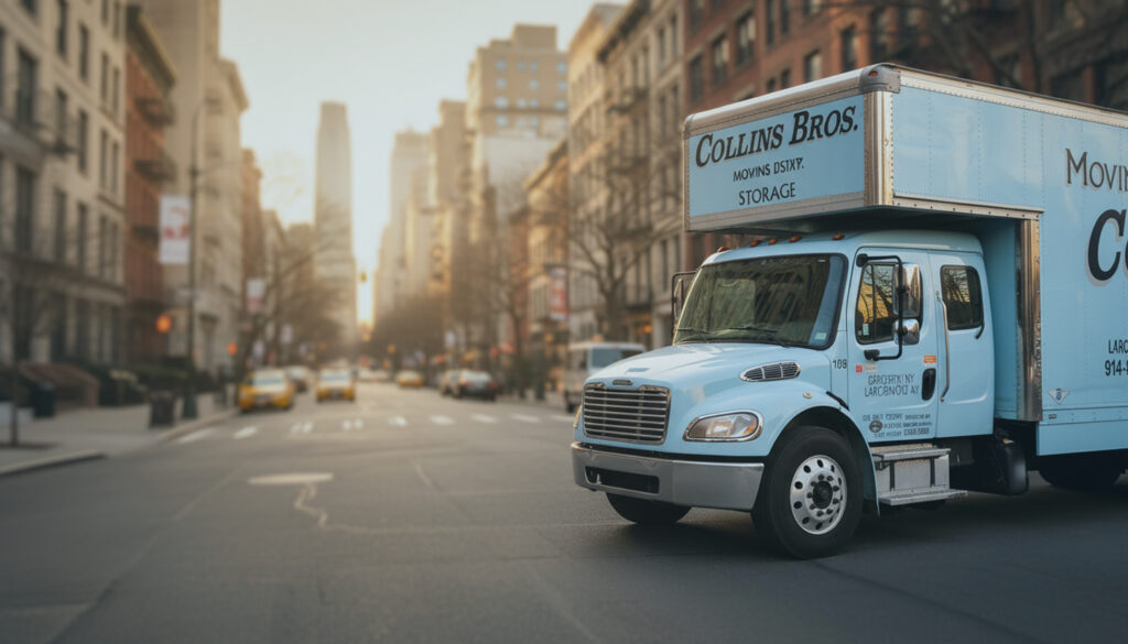
Their trucks carried a distinct visual identity anchored in the Clarendon typeface. It had presence, heritage, and credibility. Rather than introducing something new, we realigned the digital experience with what already made the brand recognizable in the physical world.
Typography became the foundation.
We refined the logo, established a consistent type system, and built a cohesive visual language that could extend across both brands while maintaining clarity and flexibility.
With no photography to support the experience, we introduced an AI-driven image strategy. This wasn’t about novelty—it was about control. We created a consistent set of visuals that matched the tone of the brand and allowed the site to feel complete from launch.
In parallel, we rethought the structure of the experience—simplifying navigation, clarifying service offerings, and improving the overall flow of information.
The Solution
The result was a complete redesign of both the experience and the interface.
The UX was restructured to reduce friction and guide users toward action. Clear hierarchy, simplified pathways, and intentional pacing replaced a fragmented experience.
Visually, the system leaned on restraint. Strong typography, controlled color, and AI-generated imagery worked together to communicate confidence without overdesigning. The design allows the brand to speak clearly, rather than compete with itself.
We also partnered on content—rewriting and refining messaging to better reflect the quality of service Collins Brothers delivers. The tone shifted from generic service language to something more aligned with a high-end, detail-oriented operation.
From there, we handled full development and launch, ensuring a fast, responsive, and scalable foundation.
The Result
Collins Brothers now has a digital presence that reflects the business they’ve built.
The brand is consistent. The experience is clear. And the first impression now aligns with the level of service they provide.
More importantly, the site now supports how customers evaluate premium services—quickly, visually, and with an expectation of trust from the outset.
This wasn’t just a redesign.
It was a realignment between what the brand is—and how it shows up.