The Problem
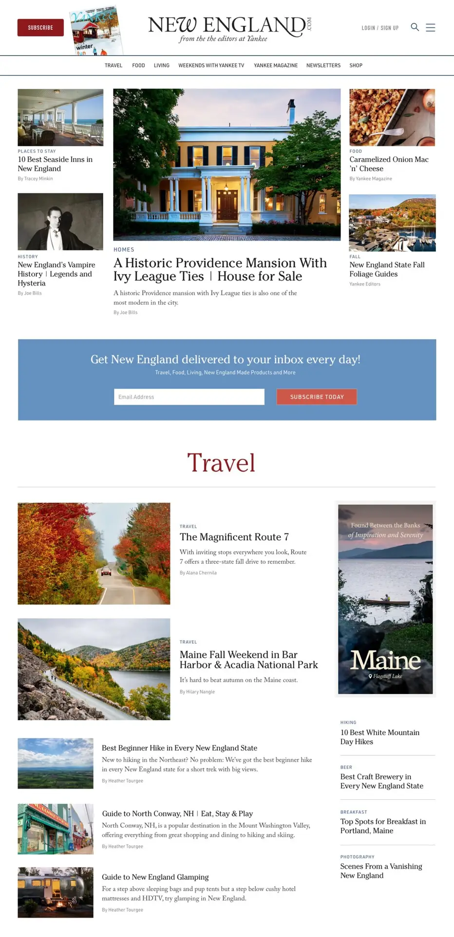
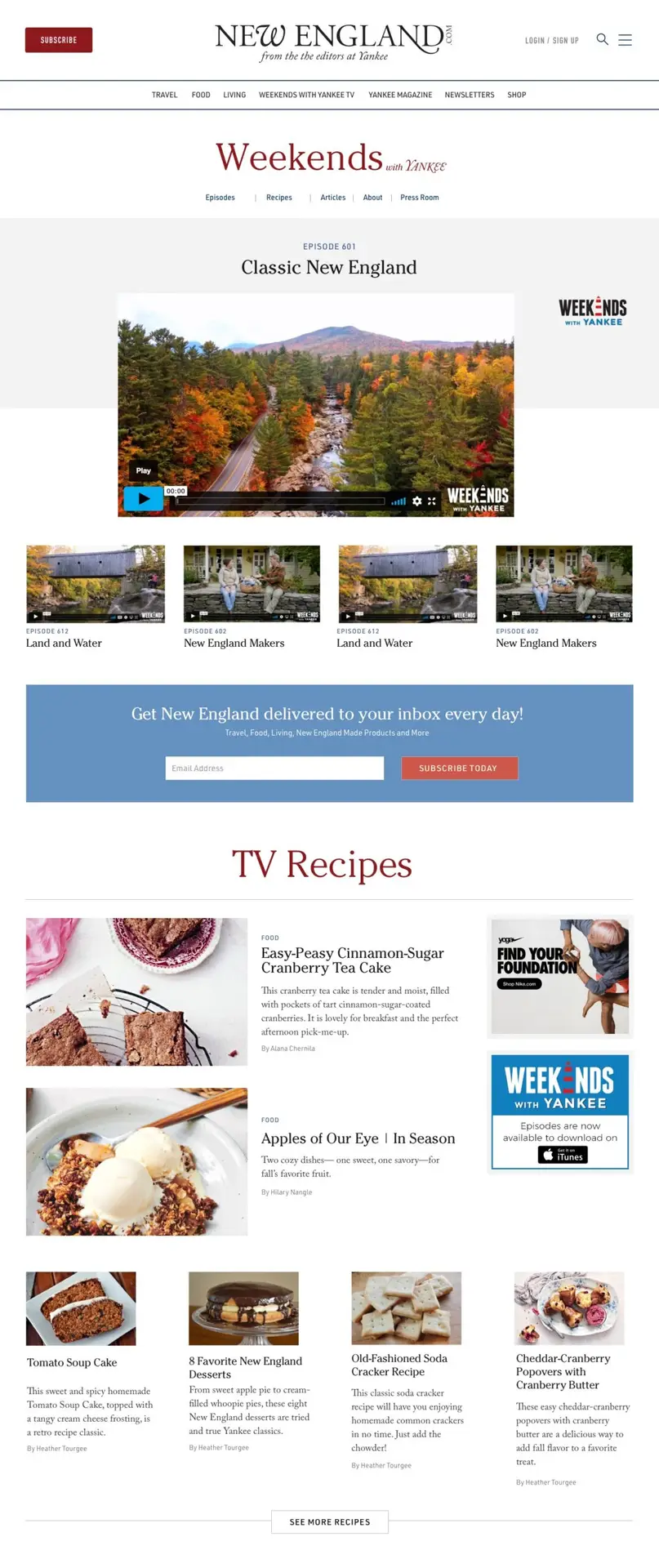
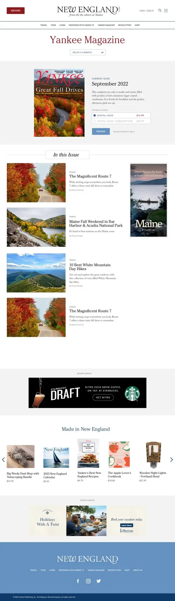
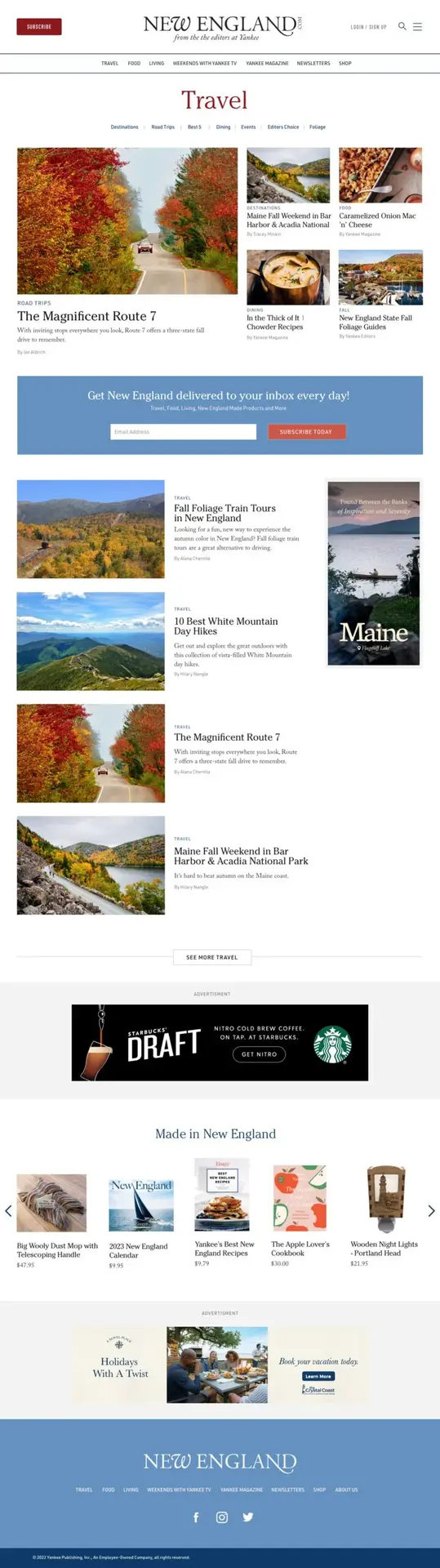
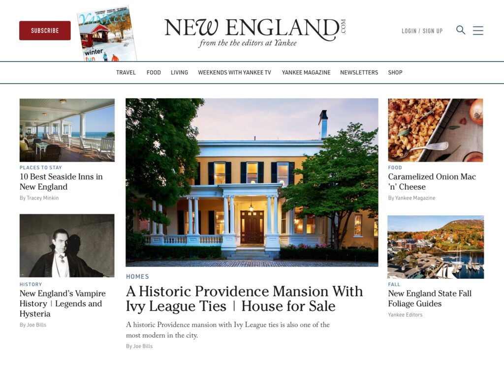
New England.com, the digital companion of the historic Yankee Magazine, needed a comprehensive brand and digital evolution after decades of incremental changes. The iconic logo had undergone multiple technical transitions from its original hand-drawn form to hot metal printing and finally to digital screens, resulting in visual inconsistencies and poor digital execution that didn’t honor the craftsmanship of the original design. The website’s content organization also required restructuring to better reflect what the 80-year-old brand represented to both employees and readers. The challenge was to bridge heritage with modern digital expectations while preserving critical SEO value and user traffic during the transformation.
The Solution
Counterspace took a research-driven approach that began with extensive historical analysis of the logo’s evolution across decades of publications and comprehensive interviews with the entire Yankee team to understand what the brand truly meant internally. This dual research foundation informed a strategic brand evolution that honored the magazine’s 80+ year heritage while modernizing the visual identity and brand voice for digital platforms. The team then developed a comprehensive user experience plan that restructured content organization to align with both company goals and user needs, implementing a visual-first approach that better reflected contemporary Yankee. Throughout the process, careful attention was paid to preserving SEO value and maintaining user traffic during the transition through strategic migration planning.
The Results
The redesign successfully transformed Yankee Magazine’s digital presence by creating a cohesive brand identity that honored their 80+ year heritage while embracing modern digital expectations. The evolved logo and unified brand voice bridged the gap between internal understanding and external presentation, while the restructured content organization and visual-first approach made everything Yankee has to offer more accessible to users. Most critically, the careful migration preserved SEO value and maintained user traffic throughout the transition, establishing a future-ready platform that unified print and digital content in one cohesive, visually-appealing format. The project received industry recognition when Yankee officially unveiled the major redesign, demonstrating how thoughtful research and strategic execution can successfully modernize a heritage brand without losing its core value or audience.