A rapid logo evolution
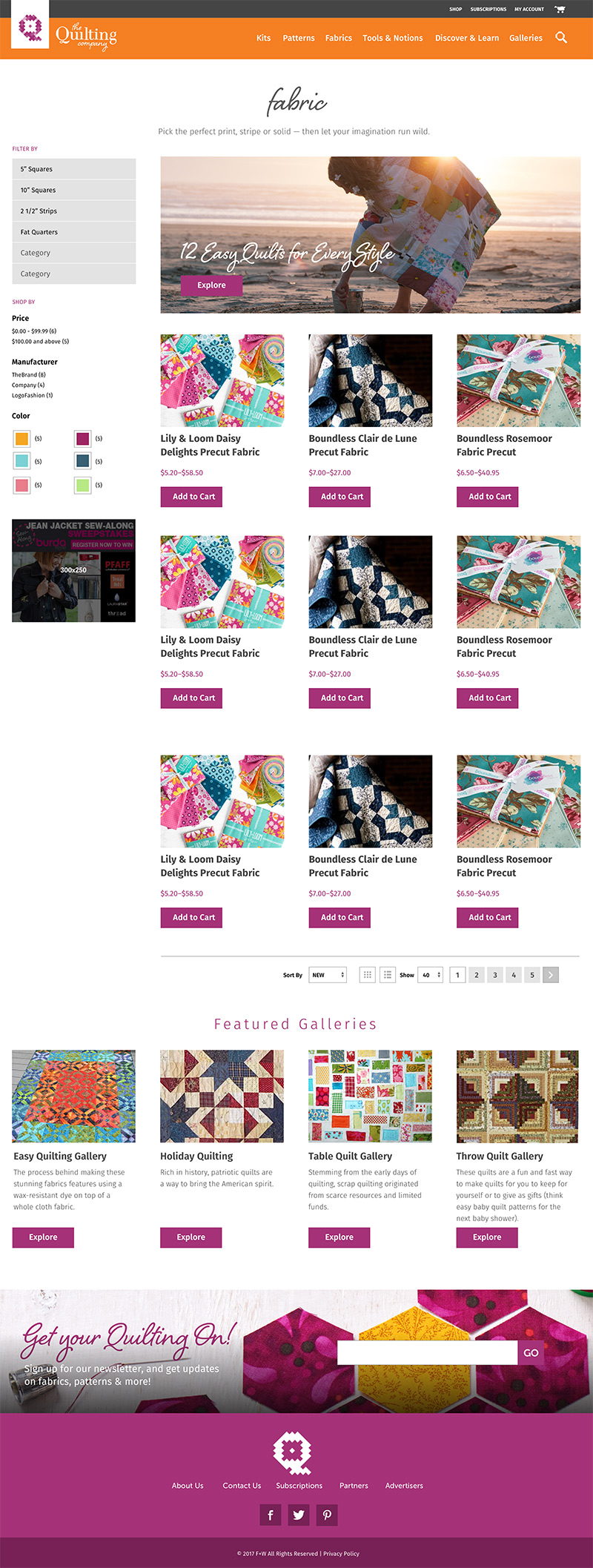
Late in 2017 I began working with The Quilting Company to assist them with architecting their new web platform. The Quilting Company had worked with two other digital vendors earlier in the year, but they were unhappy with the work that was produced. Along with the UX work that I began, TQC shared their newly created identity that would be used to launch their magazine and website. This is the story of how I evolved the logo to represent the brand of the company…
When TQC shared the logo design with me, I was immediately struck by the “dots” and the repetition of the Q. All I could see were the problems with this mark. Take a look at the design below (Figure A), and then compare it to the greyed out version on the right (Figure B).
The Vision & Process
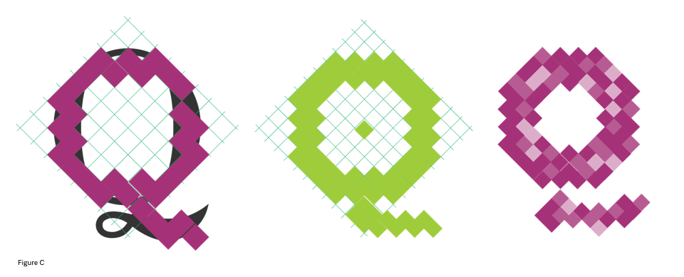
I began sketching ways to introduce a “quilting” into the logo mark. This began with taking the existing letter Q, and overlaying a grid. I then traced the letter Q using a variety of squares.
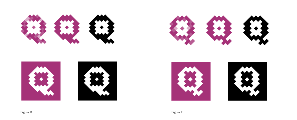
I then iterated hundreds of variations of the Q using these small squares. It reminded me of the early days of web design when I designed icons for the 640×480 screen resolution. In those days everything was created with bitmap artwork.
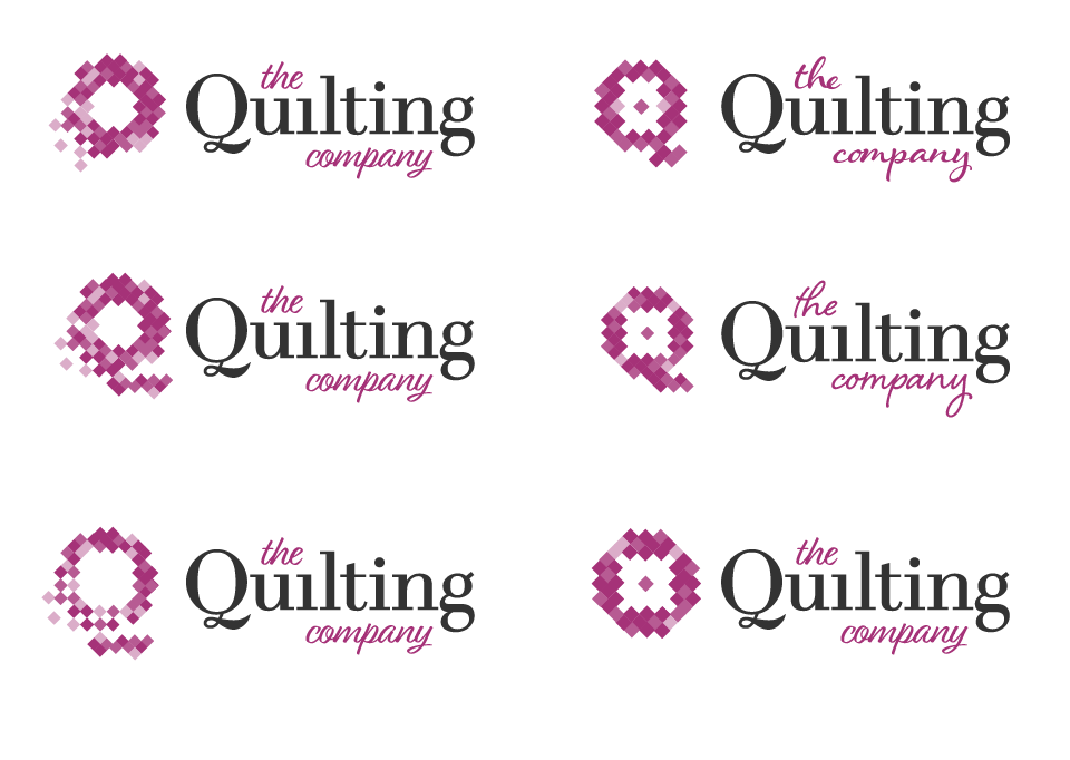
After removing the various “dots” from the type mark, I then introduced a script typeface for the supporting text. The script softened the slab serif typeface of the main type mark, while introducing a secondary typeface for the brand.
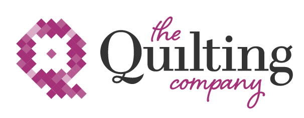
The Final Evolution
In less than 2 hours I was able to evolve Quilting logo, add personality that resonates with the target audience, while providing a solid beginning to a brand they can evolve for years to come.
UX & Website Design
The Challenge
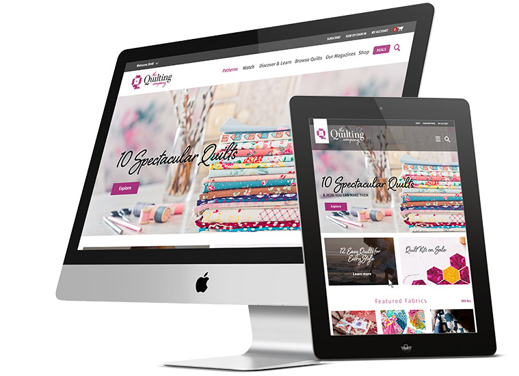
The Quilting Company website re-design project began as a UX exploration with the client. The initial problem counterspace was hired to solve was focused around creating a new navigation structure that could be incorporated within their WordPress and Magento ecommerce implementation.


