I am an observer of people. Their subtle movements. Their walk and their nervous habits. I especially enjoy observing how they interact with everyday mundane objects. It’s how I provide insight into user interaction.
User interaction experts will tell you that you have to ensure that everything is at the end fingertips of the user. That certain content should be placed in a certain place otherwise the user will never find it. For me, this has always felt like dumbing down interaction rather than elevating it. Don’t get me wrong I am all about not reinventing the wheel, but it is important to constantly test and re-test our stayed theories.
Humans have been doing this since the dawn of time, questioning whether the world was round or flat for example. Today, saying the world is flat seems like a ridiculous tall tale, but at one point the world was flat. Fact. Until someone questioned and tested his new world is round theory.
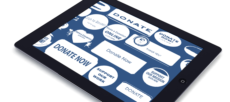
Much later on… the theory that the donate button had to be in the upper right corner of the website and red was considered by everyone to be essential. In every user test I witnessed or oversaw everyone could find the red donate button. It was expected and understood. But it was really a self fulling prophecy.
Designers began placing the donate button in the upper right corner, and over hundreds and thousands of websites this placement was copied. By everyone. Once this theory was accepted it was impossible to convince a client to move it. It seemed like an unbreakable theory.
Then, in 2008 Obama ran for president. He collected more donations online than anyone in history. His donate button was not red. It was not in the upper right hand corner. People donated to his campaign because they wanted to, and they found ways to donate. Without help, not looking in the upper right hand corner. Everyone’s mind was blown.
Now a red donate button the upper right hand corner is considered old school. I mean who would even think to do such a thing? The answer is everyone who believed the world was flat. Before Obama.
Often user testing is the source of the problem. Testing is performed on subjects who know they are getting tested. Typically they are the from the same group of users. Supplied by the same company specifically to be tested. Before the test begins the results are tainted. The results come back and they are followed blindly.
I designed websites for hundreds of candidates and every time I didn’t place the donate button in the upper right corner and make it red, and beveled, the client and the consultants would inform me of my mistake.
“People won’t know how to donate” they would tell me.
“Users don’t donate because they see a button. They donate because they want to” I would reply.
But I would always end up designing a red button. And put it in the upper right.
I have always trusted my users. I believe they are smarter than clients give them credit for. Smarter than advertisers say they are. If you listen to the rhetoric inside agencies and studios they believe that most users are idiots who can barely read.
They say “people don’t read!”
And I believe the opposite. People do read. They read all the time.
They read what they are interested in. They read the things that are close to them. Hobbies, games, movies, home buying. In fact users consume content at an alarming rate. They read. A lot. Our jobs as designers is to get them interested in something else. We can’t make them read. But we can take good content and make it consumable.
Content is much like food. You can make it look as appealing as possible but once someone tastes it, they react to it. Positively or negatively. If you try to make crap look appealing it won’t take long for your users to realize it’s crap. And you can only make crap look so good.
So back to my opening statement. I am an observer of people. I like to see how they interact with objects and challenge them to interact with objects. My job is to find different ways to present and allow people to interact with content.
The best way to do this is to tell the story of your client or their product. And use design and typography to elevate that story to become the most consumable it can be.
If you have designed well, you will never get credit. But your client will see the results. That is a designers job, or at least it should be.