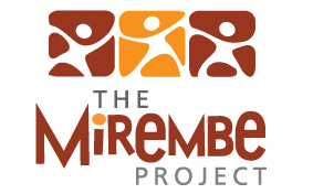
Identity creation
The Mirembe Project is a non-profit organization whose goal is to advance human rights and social justice. When the Mirembe Project took their organization online, counterspace was asked to create a logo that reflected their personality and represented the organization.
This project needed to be implemented quickly and the organization wanted the logo to reflect their name and the upbeat, positive nature of the organization. While the word Mirembe means peace, the organization wanted to avoid any cliché peace symbols and focus on the festive nature they wanted to convey.
The final logo mark is influenced by African art and dance. We choose earth colors to reflect just that, our earth. And we utilized typography that possessed a hand drawn quality to evoke a humanistic feeling. The final logo represented The Mirembe Project’s identity and has been utilized across the organization in all their endeavors.