Re-designing an online shopping cart
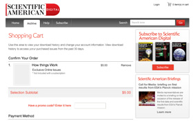
Scientific American wanted to update their online ordering process for their publications. The goal was to update and simplify the process, while creating a design that was branded closer to the Scientific American brand.
With a recent interface design update to their main site, Scientific American wanted to ensure that there was a consistent look and feel for the user while purchasing the publications.
Counterspace approached this project by quickly getting up to speed on the Scientific American branding guidelines and typography usage, creating a grid that would accommodate the process, and using simple design techniques to divide the content into “like” buckets of information. This approach allows the user to be able to easily navigate the content and locate the important information on any particular page. Through consistent use of type sizes and color, we created a simple, elegant solution that could be implemented quickly onto the custom CMS platform.